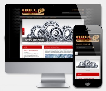
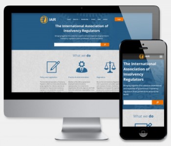
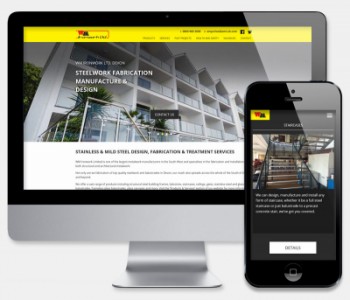
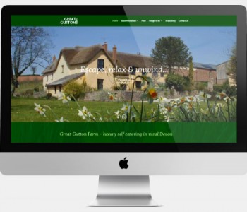
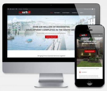
Responsive Design

What is responsive design?
"Responsive web design (RWD) is a web design approach aimed at crafting sites to provide an optimal viewing experience - easy reading and navigation with a minimum of resizing, panning, and scrolling - across a wide range of devices, from mobile phones to desktop computer monitors"
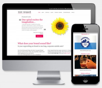
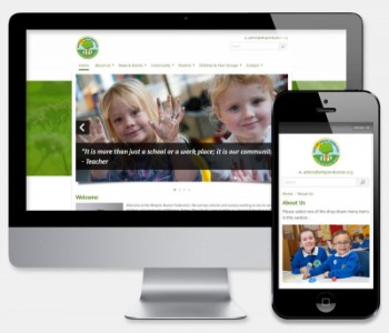
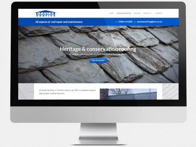
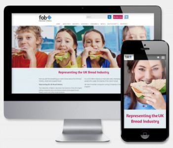
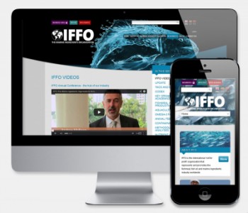
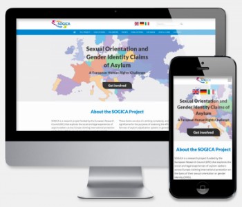
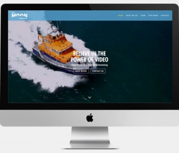
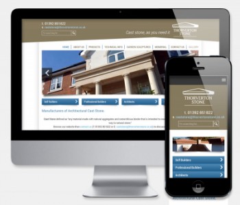
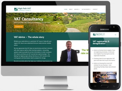
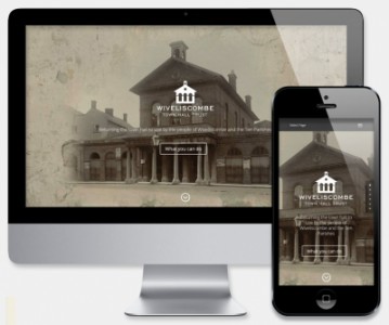
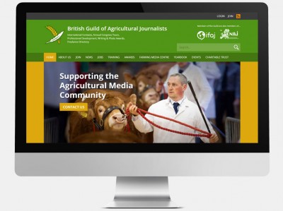
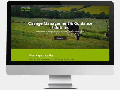
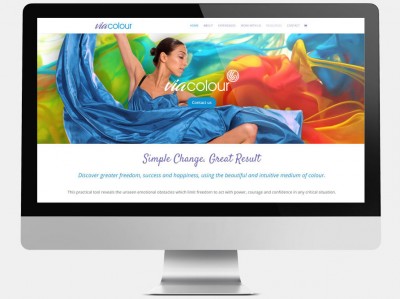
These days the majority of our clients request that their new websites be responsive, and rightly so. With the huge increase in mobile device usage and transactions being carried out on-the-move, the ability for your website to work effectively on all devices is fast becoming essential. Not only do we create beautifully crafted, responsive websites, we design them to perform this way from the get-go, ensuring that your visitors recieve the very best user experience.
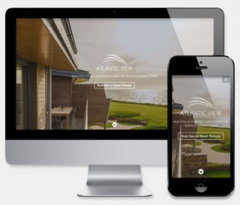
Mobile first
At Website Development Ltd, we use a 'mobile first' approach to our designs, ensuring that your new website will be optimised (or 'optimized' if you prefer) for an excellent mobile experience. Starting with sitemaps and wireframing, we ensure that your content is optimised for a variety of viewing platforms.